Of course! A periodogram is a fundamental tool in signal processing and time series analysis used to find the dominant frequencies (or "periods") in a signal.
Let's break down what it is, how to compute it in Python using scipy, and how to interpret the results.
What is a Periodogram?
At its core, a periodogram estimates the power spectral density (PSD) of a signal. Think of it as answering the question: "At which frequencies does my signal have the most power (or energy)?"
- Input: A time-series signal (e.g., a list of voltage measurements over time).
- Output: A plot showing power (y-axis) versus frequency (x-axis). Peaks in this plot correspond to the dominant frequencies present in the original signal.
The most common way to compute a periodogram is by using the Fast Fourier Transform (FFT), which is an efficient algorithm for calculating the Discrete Fourier Transform (DFT).
The Python Implementation: scipy.signal.periodogram
The go-to library for this in Python is SciPy. The scipy.signal.periodogram function is perfect for this task.
Key Parameters of scipy.signal.periodogram:
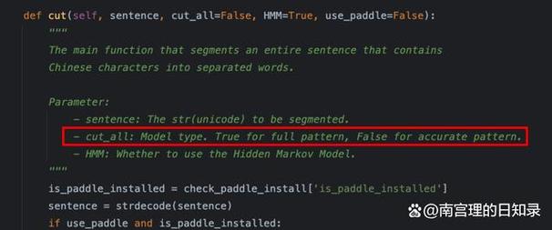
x: The input signal (a 1-D array).fs: The sampling frequency of the signal. This is crucial because it determines the frequency range of the output. If you have samples taken every second,fs=1.0. If you have 100 samples per second,fs=100.0.window: The window function to apply to the data before computing the FFT. Using a window (like 'hann') is highly recommended to reduce spectral leakage.nfft: The number of data points used for the FFT. Ifnfftis greater than the length ofx, the signal is padded with zeros. Ifnfftis smaller, the signal is wrapped. This can be used to increase frequency resolution.detrend: A function or string to remove a trend from the data (e.g.,'constant'to remove the mean,'linear'to remove a linear trend). Detrending is often a good idea.
Installation
If you don't have SciPy and Matplotlib installed, you can get them with pip:
pip install scipy matplotlib numpy
Step-by-Step Example
Let's create a signal with two known frequencies and see if the periodogram can find them.
Step 1: Import Libraries
import numpy as np
import matplotlib.pyplot as plt
from scipy.signal import periodogram
Step 2: Create a Sample Signal
We'll create a signal that is a sum of two sine waves:
- A low-frequency component at 5 Hz.
- A high-frequency component at 20 Hz.
We'll sample this signal at a rate of 200 Hz (fs=200).
# Define signal parameters
fs = 200.0       # Sampling frequency (Hz)
T = 1.0          # Duration of signal (seconds)
N = int(T * fs)  # Number of samples
# Time vector
t = np.linspace(0.0, T, N, endpoint=False)
# Create the signal: a sum of two sine waves
# 1. A 5 Hz sine wave with amplitude 0.8
# 2. A 20 Hz sine wave with amplitude 0.4
freq1 = 5.0
freq2 = 20.0
signal = 0.8 * np.sin(2 * np.pi * freq1 * t) + 0.4 * np.sin(2 * np.pi * freq2 * t)
# Add some random noise to make it more realistic
np.random.seed(42) # for reproducibility
signal += 0.2 * np.random.randn(N)
# Plot the time-domain signal
plt.figure(figsize=(12, 6))
plt.subplot(2, 1, 1)
plt.plot(t, signal)"Time-Domain Signal")
plt.xlabel("Time [s]")
plt.ylabel("Amplitude")
plt.grid(True)
Step 3: Compute the Periodogram
Now, we'll use scipy.signal.periodogram to find the frequency content of our signal.
# Compute the periodogram
frequencies, power_spectrum = periodogram(signal, fs, window='hann', scaling='density')
# 'scaling' can be 'density' (for PSD, units V^2/Hz) or 'spectrum' (for power, units V^2)
Step 4: Plot the Results
The most important step is to visualize the power spectrum. We expect to see clear peaks at 5 Hz and 20 Hz.
# Plot the frequency-domain signal (the periodogram)
plt.subplot(2, 1, 2)
plt.plot(frequencies, 10 * np.log10(power_spectrum)) # Plot in dB for better visualization"Periodogram (Power Spectral Density)")
plt.xlabel("Frequency [Hz]")
plt.ylabel("Power Spectral Density [dB/Hz]")
plt.grid(True)
plt.xlim(0, fs / 2) # Plot only up to the Nyquist frequency (fs/2)
plt.tight_layout()
plt.show()
Expected Output
As you can see from the plot:
- There is a large peak at 5 Hz.
- There is a smaller peak at 20 Hz.
- The rest of the spectrum is relatively flat, representing the background noise.
This confirms that our periodogram successfully identified the dominant frequencies in the original signal.
Important Considerations & Best Practices
a) The Nyquist Frequency
The maximum frequency you can detect is half the sampling frequency (fs / 2). This is known as the Nyquist frequency. Frequencies above this will be "aliased" and appear as lower frequencies. In our example, fs / 2 = 100 Hz, so we can correctly detect signals up to 100 Hz.
b) Windowing
If you don't use a window function, energy from a strong frequency component can "leak" into adjacent frequencies, creating smaller false peaks. This is called spectral leakage. Using a window like 'hann' (or 'hamming', 'blackman') is standard practice to mitigate this.
c) Zero-Padding (nfft)
By default, nfft is equal to the number of samples in x. If you want a smoother-looking spectrum with more data points, you can set nfft to a larger value. This does not increase frequency resolution but can make it easier to locate the peak of a narrowband signal.
# Example with zero-padding
frequencies_padded, power_padded = periodogram(signal, fs, window='hann', nfft=1024)
d) Detrending
If your signal has a strong DC offset (a non-zero mean) or a slow drift, it can create a huge peak at 0 Hz, masking other features. It's often a good idea to detrend the signal first.
from scipy.signal import detrend
signal_detrended = detrend(signal, type='constant') # Remove mean
frequencies_dt, power_dt = periodogram(signal_detrended, fs, window='hann')
Alternatives in Python
While scipy.signal.periodogram is excellent, it's good to know other options:
-
matplotlib.pyplot.psd: This is a wrapper aroundscipy.signal.periodogramand is very convenient for quick plotting.plt.psd(signal, NFFT=1024, Fs=fs, window='hann') plt.title("PSD using matplotlib.pyplot.psd") plt.show() -
numpy.fft.fft: For more control, you can use the raw FFT. You'll have to compute the power yourself and handle scaling and windowing manually. This is useful if you need a custom implementation thatperiodogramdoesn't provide.# Manual FFT approach windowed_signal = signal * np.hanning(len(signal)) fft_vals = np.fft.rfft(windowed_signal) power = np.abs(fft_vals)**2 frequencies = np.fft.rfftfreq(len(signal), 1/fs) plt.plot(frequencies, 10 * np.log10(power)) plt.title("Manual Periodogram") plt.show() -
scipy.signal.welch: This is a more advanced method for estimating the power spectral density. It works by averaging the periodograms of overlapping segments of the data. This provides a more statistically stable (less noisy) estimate of the PSD, which is especially useful for noisy signals or shorter data records.from scipy.signal import welch f_welch, Pxx_welch = welch(signal, fs, window='hann', nperseg=256) plt.semilogy(f_welch, Pxx_welch) plt.title("Welch's Method (Averaged Periodogram)") plt.xlabel("Frequency [Hz]") plt.ylabel("Power Spectral Density [V^2/Hz]") plt.grid(True) plt.show()
Summary
| Function | When to Use | Key Advantage |
|---|---|---|
scipy.signal.periodogram |
Standard use case. Good for a quick, single estimate of the PSD. | Simple, direct, and fast. |
matplotlib.pyplot.psd |
Quick, interactive plotting within a Matplotlib script. | Convenience for plotting. |
scipy.signal.welch |
Noisy signals, short data records, or when you need a smoother, more reliable PSD estimate. | Reduces variance by averaging. |
numpy.fft.fft |
When you need full control over the FFT process or are implementing a custom algorithm. | Maximum flexibility. |
For most users, starting with scipy.signal.periodogram is the perfect way to perform periodogram analysis in Python.

