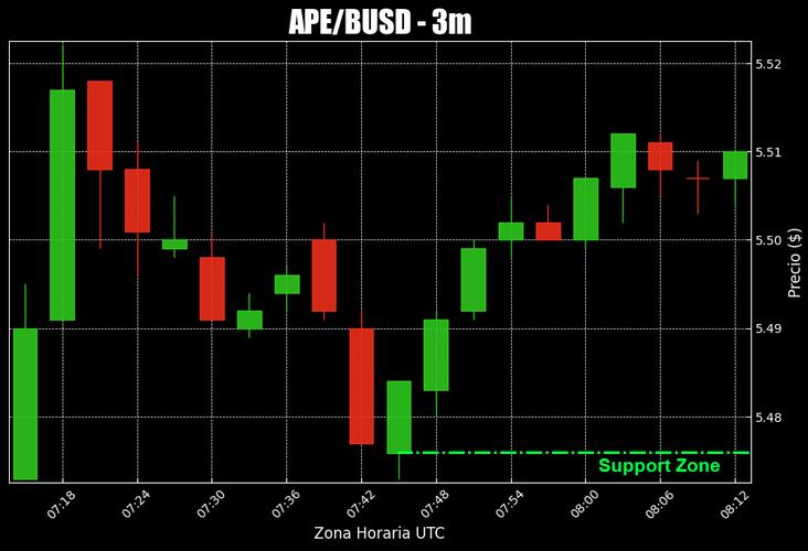
Of course! Creating candlestick charts in Python is a common task for financial analysis and data visualization. The most popular and powerful library for this is mplfinance, which is built on top of Matplotlib.

Here’s a comprehensive guide, starting with the basics and moving to more advanced customization.
Prerequisites
First, you need to install the necessary libraries. mplfinance is the star of the show, but you'll also need pandas for data handling and yfinance to easily fetch stock data.
pip install mplfinance pandas yfinance
Part 1: The Basics - Creating a Simple Candlestick Chart
We'll start by fetching some sample data and plotting a standard candlestick chart.
Step 1: Fetch Data
We'll use yfinance to download historical data for a stock (e.g., Apple Inc., 'AAPL').
import yfinance as yf
import mplfinance as mpf
import pandas as pd
# Download historical data for Apple
# We get the last 50 days of data with a 1-day interval
data = yf.download('AAPL', start='2025-01-01', end='2025-01-01', interval='1d')
# Ensure the data is in a pandas DataFrame with a DatetimeIndex
# yfinance usually handles this, but it's good practice to check
print(data.head())
The data DataFrame will have columns like Open, High, Low, Close, and Volume, which are exactly what mplfinance needs.
Step 2: Plot the Candlestick Chart
This is the core of the task. mplfinance makes it incredibly simple.
# Create a basic candlestick chart
mpf.plot(data, type='candle', style='charles')
Code Breakdown:
mpf.plot(): The main function to generate the plot.data: The pandas DataFrame containing the OHLC data.type='candle': Specifies that we want a candlestick chart. Other types include'line','ohlc', and'renko'.style='charles': Sets the color style. Other popular styles include'yahoo','mike', and'classic'.'charles'is a good default (green for up, red for down).
This will open a window displaying the candlestick chart:

Part 2: Adding Volume and Moving Averages
A financial chart is much more useful with volume bars and trend indicators like Moving Averages (MAs).
Step 1: Add Volume
To add volume, you just need to include the volume column from your DataFrame.
mpf.plot(data, type='candle', style='charles', volume=True)
The volume=True argument adds a panel at the bottom showing the trading volume as vertical bars.
Step 2: Add Moving Averages
mplfinance has a convenient mav (moving average) argument to easily add MAs.
# Add 20-day and 50-day moving averages
mpf.plot(data, type='candle', style='charles', volume=True, mav=(20, 50))
mav=(20, 50): This adds two moving averages: one with a 20-day window and another with a 50-day window.mplfinanceautomatically colors them differently.
This gives you a much richer chart:
Part 3: Advanced Customization
mplfinance offers extensive control over every aspect of the chart. Here are some of the most common customizations.
Setting the Main Title and Labels
You can customize the title, Y-axis label, and volume panel label.
mpf.plot(
    data,
    type='candle',
    style='charles',
    volume=True,
    mav=(20, 50),'Apple Inc. (AAPL) - 2025',
    ylabel='Price ($)',
    ylabel_lower='Volume'
)
Changing Colors and Themes
You can define your own color schemes.
# Define a custom color set
my_color = 'darkblue' # A more professional blue
mpf.plot(
    data,
    type='candle',
    style='classic', # Using a simpler style to see the colors better
    volume=True,
    mav=(20, 50),'Custom Colors',
    ylabel='Price ($)',
    ylabel_lower='Volume',
    # --- Customization arguments ---
    # Color for up (bullish) candles
    up_color=my_color,
    # Color for down (bearish) candles
    down_color='red',
    # Color for the moving averages
    mavcolors=['orange', 'purple'],
    # Color for volume bars
    volume=True,
    # You can also set a background color
    figratio=(16, 8) # Figure size ratio (width, height)
)
Using mpf.style
For more advanced styling, you can create a mplfinance style object. This is very powerful as it lets you bundle many settings together.
# Create a custom style
s = mpf.make_mpf_style(
    base_mpf_style='yahoo',
    gridstyle='',
    y_on_right=False # Put Y-axis labels on the left
)
# Apply the custom style
mpf.plot(
    data,
    type='candle',
    style=s,
    volume=True,
    mav=(20, 50),'Using a Custom Style Object'
)
Adding Custom Plots (e.g., Bollinger Bands)
Sometimes you want to plot an indicator that mplfinance doesn't have a built-in shortcut for. For this, you use the addplot argument.
First, let's calculate the Bollinger Bands.
# Calculate Bollinger Bands
# Calculate the 20-day simple moving average
data['MA20'] = data['Close'].rolling(window=20).mean()
# Calculate the standard deviation
data['STD20'] = data['Close'].rolling(window=20).std()
# Calculate the upper and lower bands
data['UpperBand'] = data['MA20'] + (data['STD20'] * 2)
data['LowerBand'] = data['MA20'] - (data['STD20'] * 2)
# Now, create an 'ap' (addplot) list
ap = [
    mpf.make_addplot(data['UpperBand'], color='g', linestyle='--'),
    mpf.make_addplot(data['MA20'], color='b', width=1.5),
    mpf.make_addplot(data['LowerBand'], color='g', linestyle='--')
]
# Plot the candlestick chart with the addplots
mpf.plot(
    data,
    type='candle',
    style='charles',
    volume=True,
    addplot=ap,'AAPL with Bollinger Bands'
)
mpf.make_addplot(): A helper function to format a pandas Series for plotting on the main price chart.addplot=ap: The list of plots to add to the chart.
This gives you a highly customized chart with your own technical analysis indicators:
Part 4: Saving the Chart to a File
You can easily save the chart to an image file (PNG, JPG, PDF, SVG, etc.) using the savefig argument.
mpf.plot(
    data,
    type='candle',
    style='charles',
    volume=True,
    mav=(20, 50),'Apple Inc. (AAPL) - 2025',
    savefig='aapl_candlestick_chart.png' # Save to a file
)
print("Chart saved to aapl_candlestick_chart.png")
Summary of Key mpf.plot() Arguments
| Argument | Description | Example |
|---|---|---|
type |
The chart type. | 'candle', 'line', 'ohlc' |
style |
The color scheme. | 'charles', 'yahoo', 'mike' |
volume |
Show/hide volume panel. | True, False |
mav |
Moving average(s) to add. | 10, (10, 20, 50) |
ylabel, ylabel_lower |
Axis labels. | 'Price ($)', 'Volume' |
figratio |
Figure size (width, height). | (16, 8) |
savefig |
Save the chart to a file. | 'my_chart.png' |
addplot |
A list of custom plots to add. | [ap1, ap2] |
up_color, down_color |
Colors for bullish/bearish candles. | 'green', 'red' |
mplfinance is an excellent library for this task. It's fast, flexible, and designed specifically for financial market analysis, making it the go-to choice for candlestick charts in Python.

